CVS Health: CycleFill Dashboard
A CVS Health company, Omnicare is a national provider of long-term care pharmacy services. Omnicare pharmacies are institutional pharmacies that service post-acute patients at skilled nursing facilities (nursing homes) and residents in senior living communities (assisted living and independent living facilities).
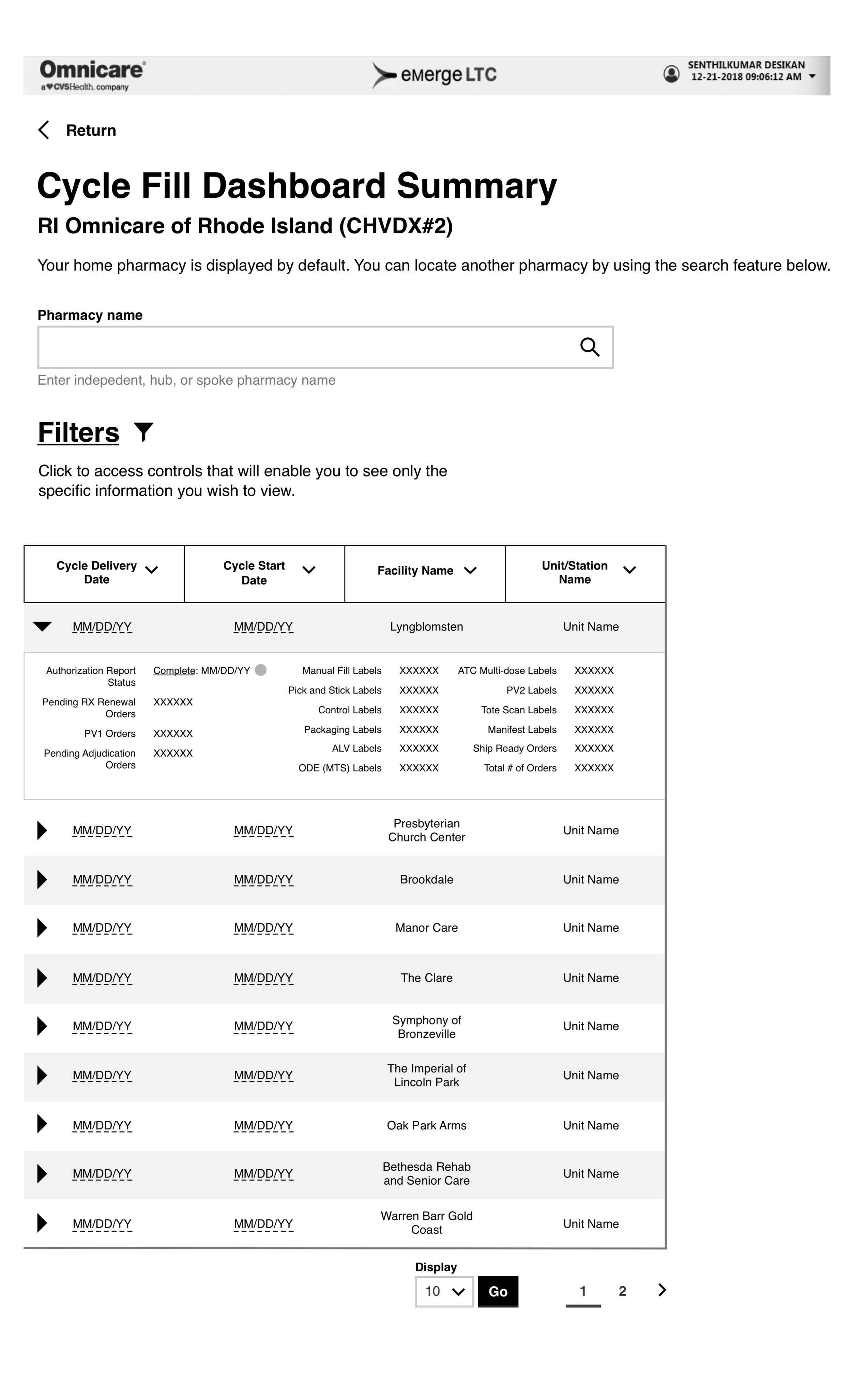
Hosted on the eMerge LTC platform (developed by a third-party vendor), the Cycle Fill dashboard will be a tool that assists Omnicare pharmacists and pharmacy technicians in tracking the monthly batch (cycle fill) of medications for the facilities and units within facilities that they service. Most importantly, it will provide a real time holistic/at-a-glance view of each stage of the workflow for each facility and unit that the pharmacists and technicians support while also allowing for multiple modes of label printing.
There were a number of challenges that I faced with this design including the following:
The requirements creation process was arduous to say the least and required heavy and consistent attention from me acting as the main UX champion throughout.
I was not able to meet with the members of the audience for this application, much less schedule user testing. I made the most out of communicating with the business team and conferring with my UX colleagues.
Visually moved on from the dashboard’s predecessor responding to the need to adhere to the current design system as well as being ADA compliant.
Designed for the requirement that up to 20 columns had to be displayed at once. In order to land on the right solution, I experimented with multiple means of displaying columns including “display on-demand” and “rolled up”, accordion approaches.
The filters needed for the dashboard changed in number and type and I needed to account for this in my design. Additionally, I wrangled with both placement and whether these should be exposed upon load and whether they should reside in an expand/collapse container. With the reduction of the number of filters and my decision to group the pharmacy selection element in with the other filters, I was able to position the filters so that they were proximate to the table – the central piece of the dashboard, reduce their container’s height so that there was not a lot of scrolling to get to the table, and leave them as visible, static elements.
While also fulfilling the standard needs of a column head – label, sorting control, “sorted” treatment, et al. – the requirements also mandated a need to access the detail pages of the dashboard and an ability to print “runs” of labels. In order to accommodate the two latter, I iconized both the detail page link and the print functionality, positioning these directly under the column headers, and providing a legend to inform users as to their purposes.

Backend Dashboard - Predecessor to the CycleFill Dashboard

Previous Design for Dashboard
Preliminary Wireframes

Design retains the pharmacy name header (black bar) in the same position as previous wires.

Pharmacy name selection element kept separate at this point due to the potential for it to be lost in the considerable number of filters present, but also to emphasize that selecting a pharmacy effects everything else that is displayed on the screen.

Patterns for Column Display - experimenting with display “palette”, trying to reduce page width if possible.
Patterns for Column Display - collapsing columns into accordion display, again trying to find ways to reduce page width.

With the requirement that all 20 columns need to be displayed (most of the time), finding a way to break up the page horizontally. Note the “Go to Page 2” link.
Final Wireframes
Final Wireframe for Dashboard “First Up” State - Scrolling is used to view all of the columns.

Annotated Wireframe Part 1 - For UX, business, and especially development teams.

Annotated Wireframe Part 2
“Print Run” Modal - Accessed from the printer icon, allows pharmacists and pharmacy technicians to print entire cycle fills for a given facility and unit.
Detail Page - Accessed from “document” icon, enables the user to drill down into a particular step in the process and/or label categorization and see individual prescriptions for patients and print a single label.