Advisor360: Insurance Display Application
For Advisor360, I worked as a member of a small UX team in the creation of the insurance/annuity display application which itself was part of a full-service wealth management platform. (Advisor360 is a fin-tech startup that branched off from its parent company, Commonwealth Financial Network, to become its own entity.)
With the user set being insurance advisors or financial advisors who sell insurance, the requirement for the insurance display application was to provide a display on which would reside all of the policies for a given household.
To make the abundance of policy details more manageable, we broke down the display of individual policies into two parts: a “collapsed” policy box and an “expanded” full display of all of the details of a policy divided up into groupings of display cards that appear across a series of tabs.
Concerning the policy box, its bounding container indicates what policy type it is of (Universal Life, Disability Income, Indexed Annuity, etc.) and, inside, lies capsules which surface the most important information for the policies such as policy number, owner, insured, loans taken against, among other details. This was done so that the user could gather the most important pieces of information without having to expand the policy out and search across the tabs and cards. Additionally, it makes it easier for the user to understand quickly what coverages the end client has by reviewing the various policy boxes on the insurance page for that household.
As for the full displays, the tabs and cards employed in the design needed to be flexible in nature so as to work across all policy types, but also needed to house not just label/value pairs, but also tabular data as well. Additionally, within a given policy type, there are various strains: datafeed – those that come in the datafeed from the client, pending – policies that are still in underwriting also coming in on the datafeed, and manually entered policies – policies whose data was entered manually by either the advisor, office staff member, or by the end-client.
Single term life policy in the expanded view at the three-column breakpoint.
All of the above permutations had to be taken into account when it comes to the displays in either policy box or full display.
Further requirements for insurance display was the need to respond to the variable of static and dynamic fields. Static fields are defined as being those that had to be present on the display at all times even if there was no data for it (with no data, the label would appear with the text “No data available” beneath it). Whereas, dynamic fields are those that would either come in and be displayed or not come in and not be displayed at all.
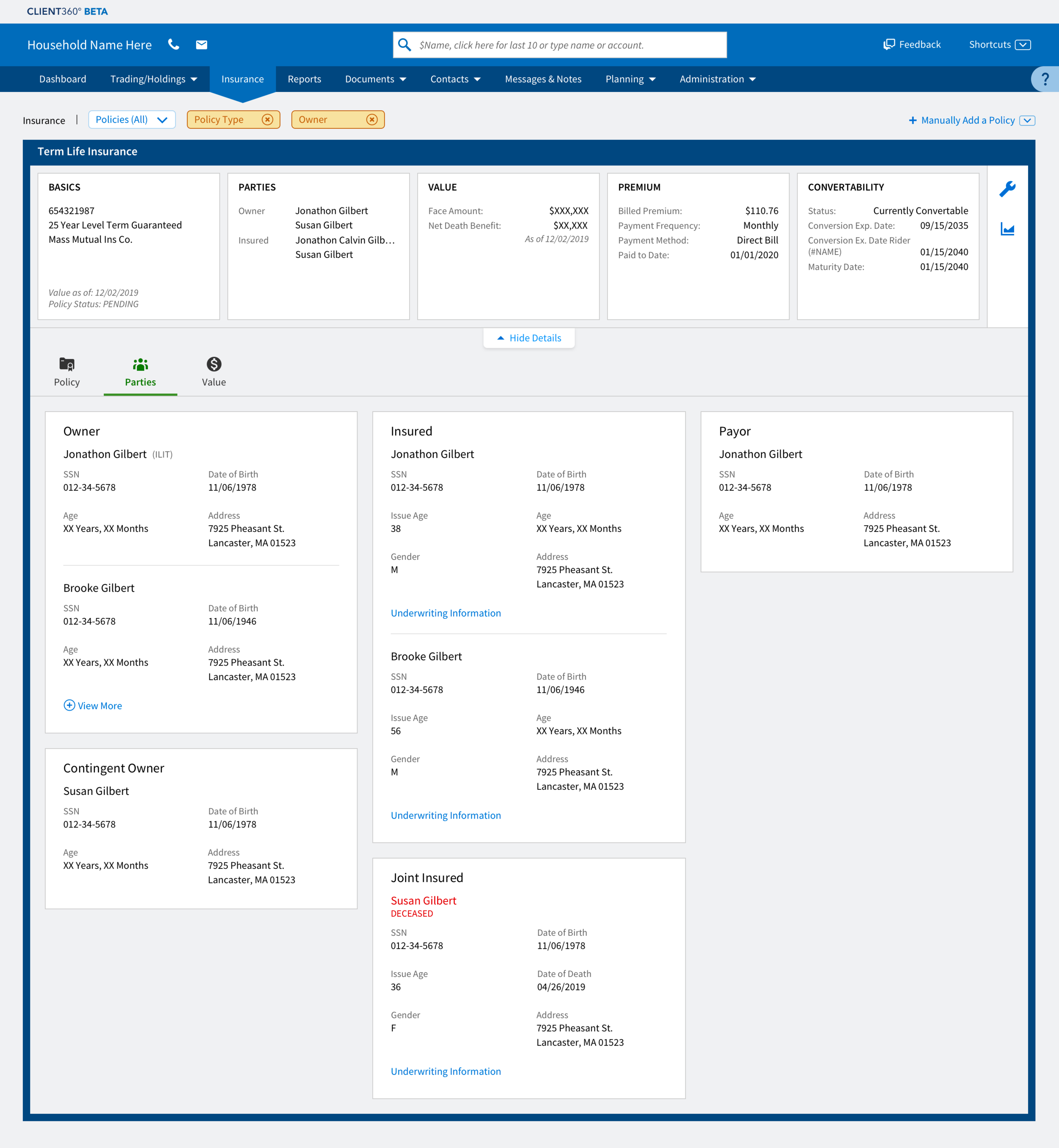
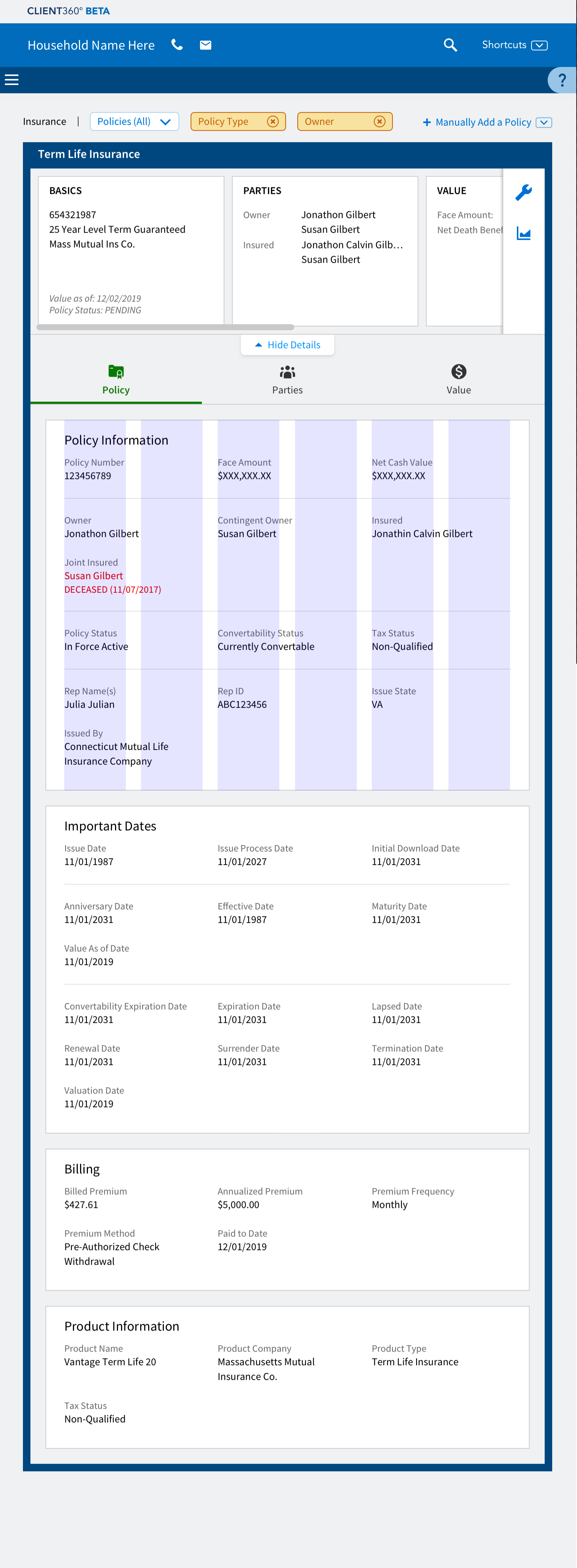
Given the fluid nature of the fields, we developed a z-sliding pattern to accommodate the addition or subtraction of fields within a card. Additionally, to allow for the displays to be responsive, there is also a sliding pattern for the cards themselves, whereby cards in the far right column will slide under the cards in the center column at a narrower breakpoint until, at the tablet breakpoint, the cards appear in a single column.
For the insurance display application, I also designed the manual entry forms which afford the ability to advisors, their staff, and end clients of adding to a particular household “held away” policies. “Held-away” policies are those that are not held by Advisor360’s first client, MassMutual. So policies at say Northwestern Mutual or Pacific Life which would not be accounted for in a datafeed can still be represented on a given household’s insurance page and give the insurance advisor the full picture as to a household’s coverage.
Challenges that I faced on this project included the following:
It took many months for anything approaching firmed up or even organized requirements to come together and a lot of my design work required steady contact with the product owner and meetings with the MassMutual stakeholders.
The huge number of display scenarios, e.g. what do tables as they appear in cards look like when all rows have data, some of the rows have partial data, and when the table itself has no data at all? Simultaneously needing to be borne in mind is the behavior of static and dynamic categories of fields and how this would affect the table.
The fact that we didn’t have even a barebones design system until the 11th hour, something that made me rely on communicating with my UX designer peers as well as our visual designer and the creative director.
Additional to the responsibilities above, I acted as the UX point person during the daily scrum meeting, guiding the team through the almost endless data display scenario’s that were possible. This included both daily support in the scrum meetings – answering questions within the meeting itself, as well as tackling JIRA stories that captured the concerns of QA engineers about how to handle a particular situation in the display.

Wireframe of insurance page with all policy types present.

Wireframe of expanded pending policy.

Manual entry form that allows for the inclusion of “held away” policies onto a household’s insurance display page.

Term life policy at the three-column breakpoint. Note that larger cards are broken up into sections of related fields.

Term life policy at the two-column breakpoint.
Term life policy at the one-column/tablet breakpoint.
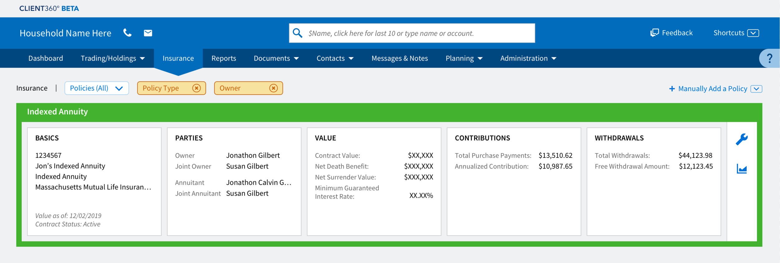
Policy box detail for an indexed annuity policy. There appears labels in the capsules except where space considerations come into play (Basics capsule) with the latter benefiting from the fact that insurance advisors and there staff immediately understand what each of the items represent; e.g. policy number, policy title, policy type, etc.
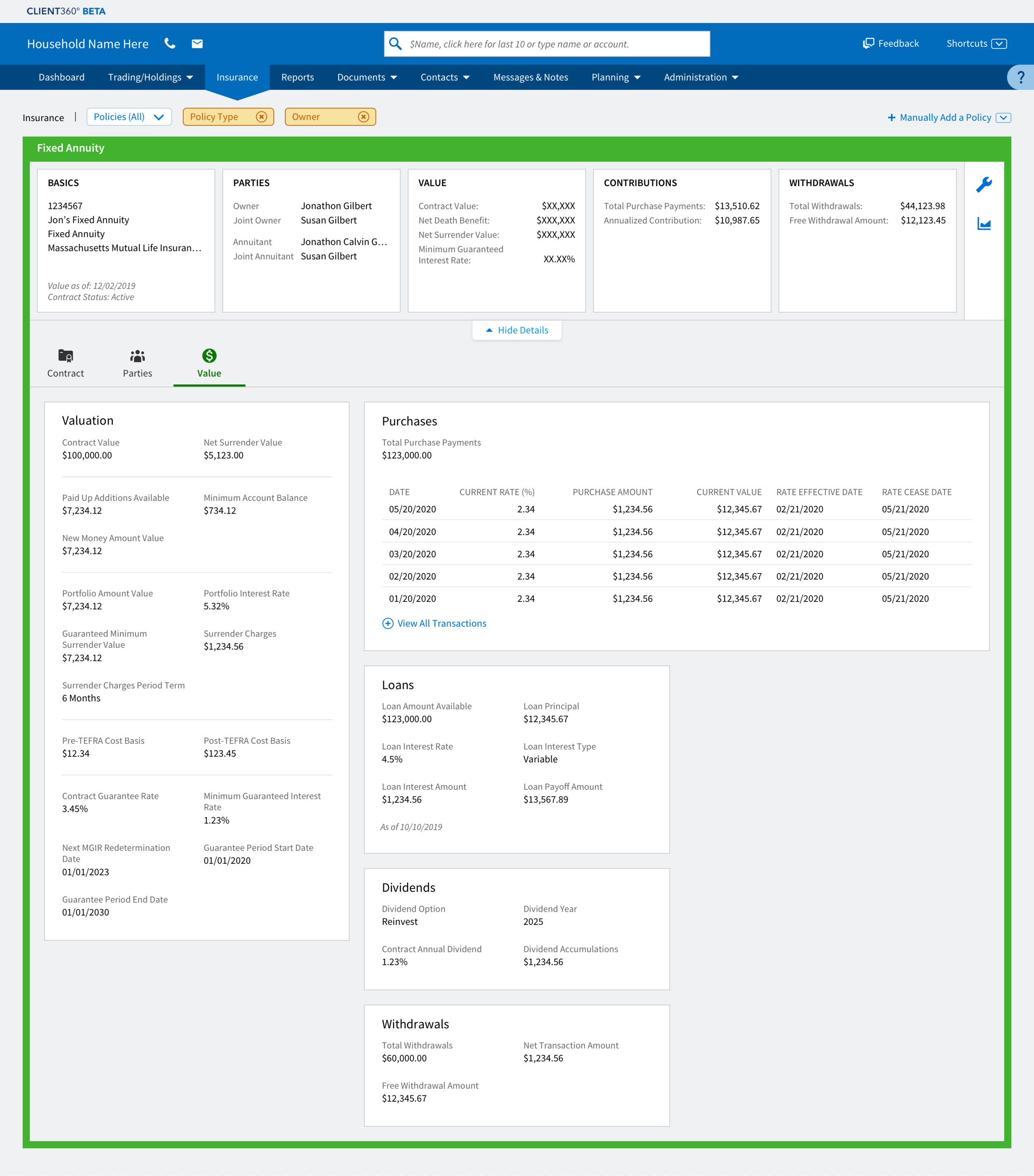
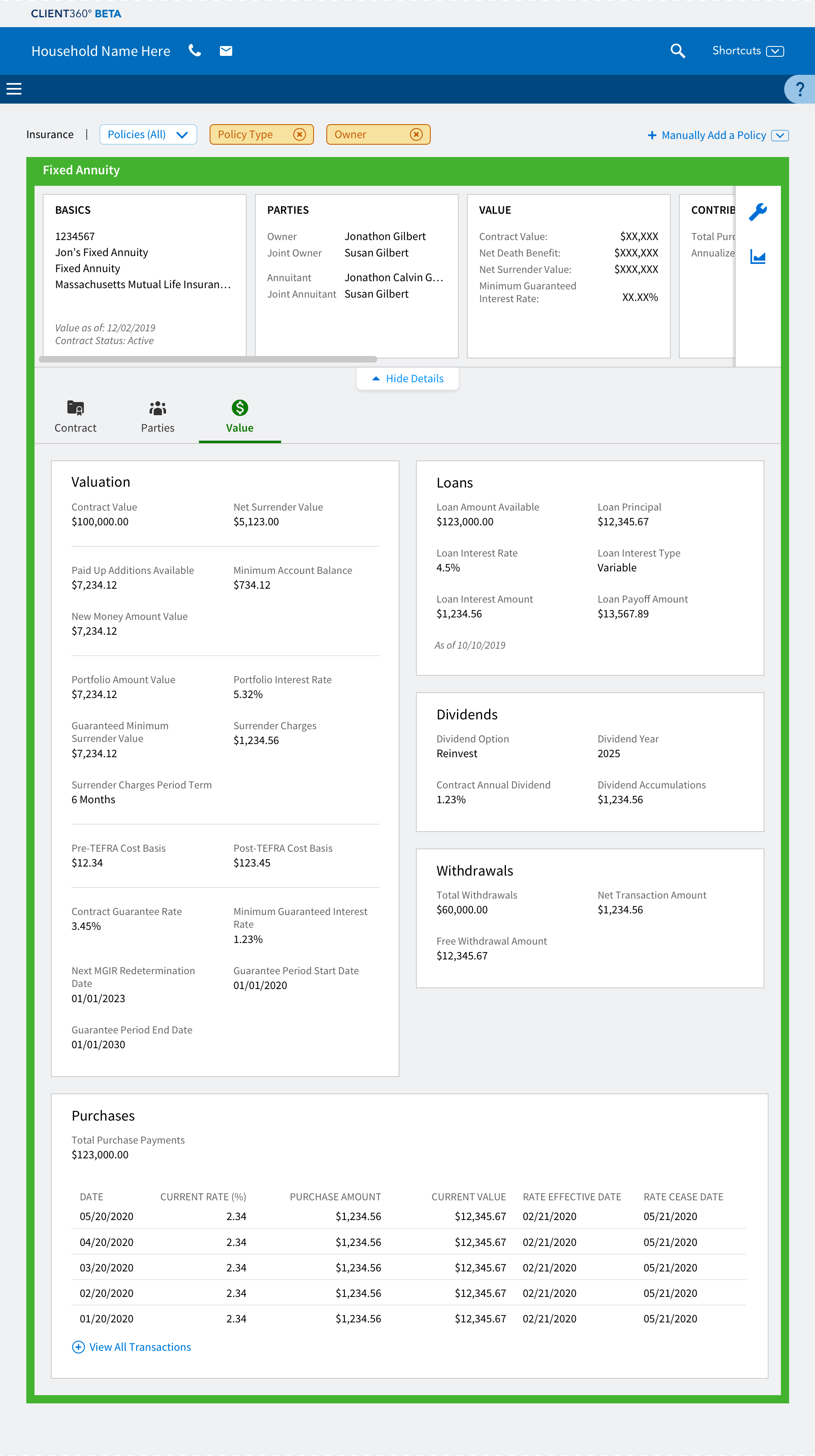
Fixed annuity policy with a double-wide/tabular card at the three-column breakpoint. Note that the color of the border color of the policy box and its expanded view is used to group families of policies, i.e. an indexed annuity policy and fixed annuity bear the same outlining green, the color assigned to annuities on the display page.
Fixed annuity policy with a double-wide/tabular card at the two-column breakpoint. As the card must render at this width, it does not follow the standard “z-pattern” of sliding, but instead moves to the bottom.

Fixed annuity policy with a double-wide/tabular card at the one-column/tablet breakpoint.
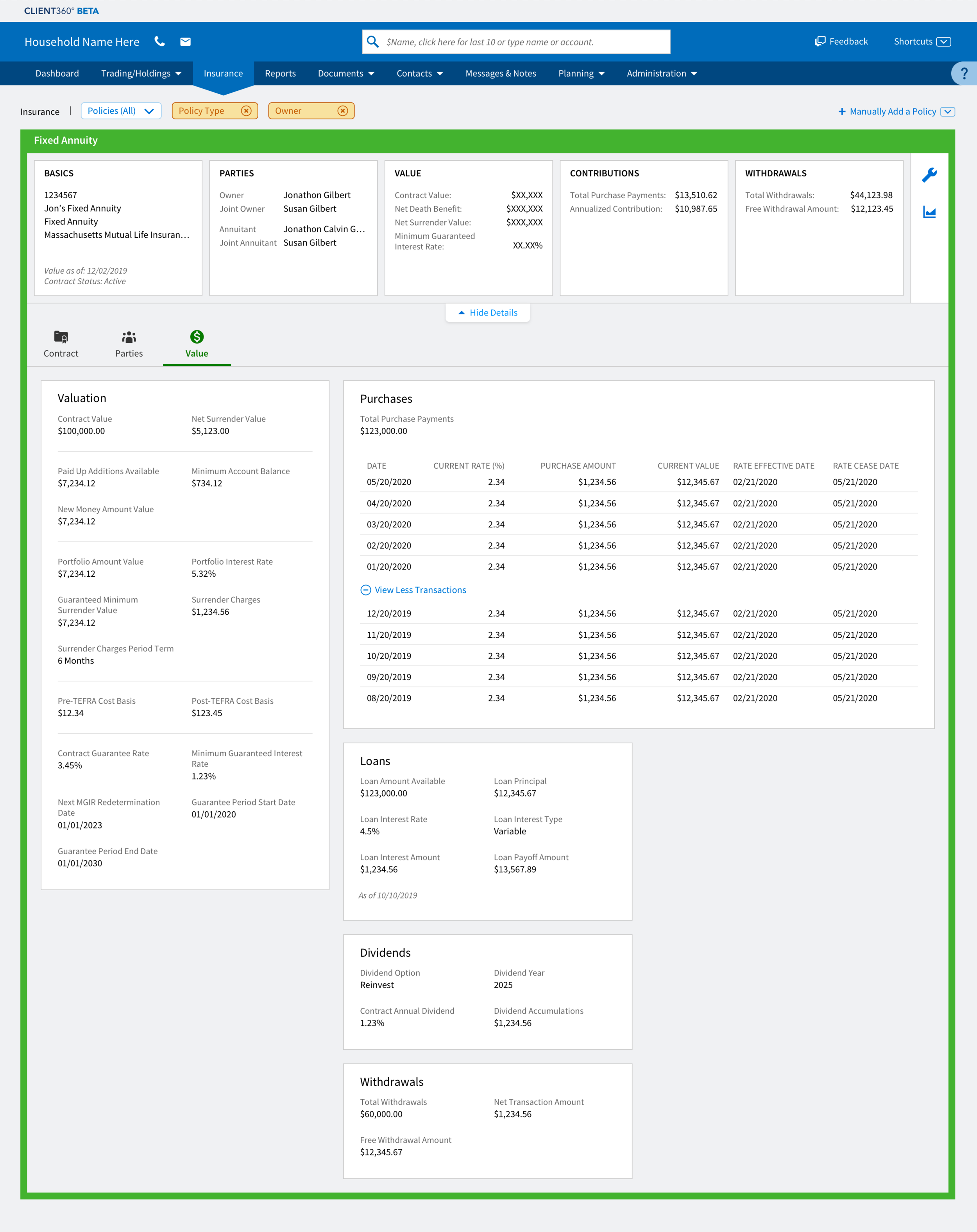
Fixed annuity policy with a double-wide/tabular card expanded to reveal further transactions.